In this guide, we'll build a functional button in React that shows how to:
- Use TypeScript interfaces
- Use union types to manage states like loading/success/error
- Handle button clicks and show status
- Use `useState` to manage local component state
Let’s start step-by-step and combine everything in the end!
 The Button Props
First, we define the expected props for our button — a title and a disabled flag.
This ensures TypeScript knows what values to expect when using the `MyButton` component.
 Defining the Request State
We want to show different states like "idle", "loading", "success", or "error".
We define a union type `RequestState<T>` which allows us to track the state and optionally pass data or an error.
This is very flexible and reusable — you can use this pattern in many components.
 Creating the MyButton Component
We now build the actual `MyButton` component that uses both the props and the union type.
What's happening here?
- `useState<RequestState<string>>` initializes the request state to `idle`.
- `enabled` is a flag to toggle the button availability.
- When clicked, the button goes into a loading state, and after 1 second, it shows success.
- We also disable the button while loading or if `enabled` is false.
 Using the Button in the App
Finally, we call the `MyButton` component inside our main `MyApp` component.
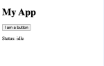
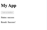
Output:
- A button titled "I am a button"
- Click it to trigger loading and then show a success message with dynamic state updates!
 Recap
Recap
- We used TypeScript interfaces for props validation.
- Created a union type to handle multiple request states.
- Managed UI changes using useState and conditional rendering.
This pattern is very helpful in real-world apps where you make API calls and need to show different UI states.
Hope this helps in your React + TypeScript learning journey!
Let me know if you want the same thing with fetch calls or loading spinners next. Happy coding!
- Use TypeScript interfaces
- Use union types to manage states like loading/success/error
- Handle button clicks and show status
- Use `useState` to manage local component state
Let’s start step-by-step and combine everything in the end!
The Button PropsFirst, we define the expected props for our button — a title and a disabled flag.
JavaScript:
interface MyButtonProps {
  title: string;
  disabled: boolean;
}We want to show different states like "idle", "loading", "success", or "error".
We define a union type `RequestState<T>` which allows us to track the state and optionally pass data or an error.
JavaScript:
type RequestState<T = unknown> =
  | { status: 'idle' }
  | { status: 'loading' }
  | { status: 'success'; data: T }
| { status: 'error'; error: Error };We now build the actual `MyButton` component that uses both the props and the union type.
JavaScript:
import { useState } from "react";

function MyButton({ title, disabled }: MyButtonProps) {
  const [requestState, setRequestState] = useState<RequestState<string>>({ status: 'idle' });
  const [enabled, setEnabled] = useState<boolean>(true);

  const handleClick = () => {
    console.log('Button clicked');
    setRequestState({ status: 'loading' });

    setTimeout(() => {
      setRequestState({ status: 'success', data: "Success!" });
      setEnabled(!enabled);
    }, 1000);
  };

  return (
    <>
      <button disabled={disabled || !enabled} onClick={handleClick}>
        {title}
      </button>
      <p>Status: {requestState.status}</p>
      {requestState.status === 'success' && <p>Result: {requestState.data}</p>}
    </>
  );
}- `useState<RequestState<string>>` initializes the request state to `idle`.
- `enabled` is a flag to toggle the button availability.
- When clicked, the button goes into a loading state, and after 1 second, it shows success.
- We also disable the button while loading or if `enabled` is false.
Using the Button in the AppFinally, we call the `MyButton` component inside our main `MyApp` component.
JavaScript:
export default function MyApp() {
  return (
    <div>
      <h1>My App</h1>
      <MyButton title="I am a button" disabled={false} />
    </div>
  );
}
Output:
- A button titled "I am a button"
- Click it to trigger loading and then show a success message with dynamic state updates!
Recap- We used TypeScript interfaces for props validation.
- Created a union type to handle multiple request states.
- Managed UI changes using useState and conditional rendering.
This pattern is very helpful in real-world apps where you make API calls and need to show different UI states.
Hope this helps in your React + TypeScript learning journey!
Let me know if you want the same thing with fetch calls or loading spinners next. Happy coding!